
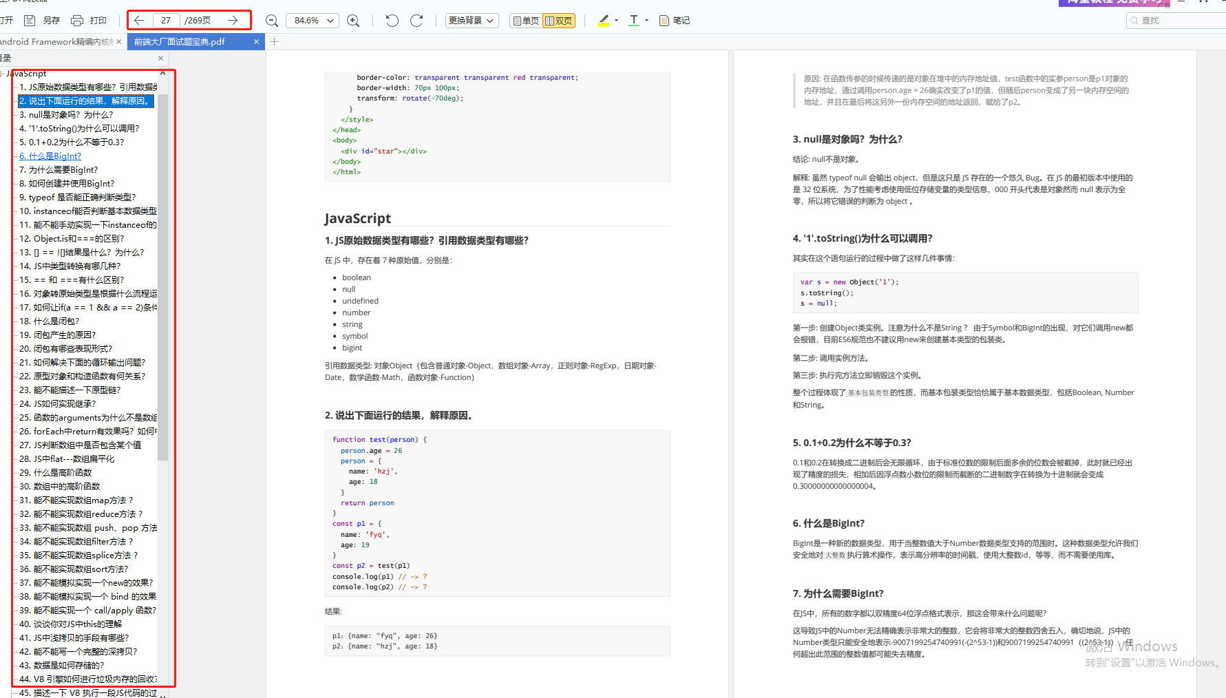
网站开发进阶(五十七)纯CSS画的基本图形(矩形、圆形、三角形
width: 0;
height: 0;
border-top: 50px solid transparent;
border-right: 100px solid red;
border-bottom: 50px solid transparent;
}
### 右三角

#triangle-right {
width: 0;
height: 0;
border-top: 50px solid transparent;
border-left: 100px solid red;
border-bottom: 50px solid transparent;
}
### 平行四边形

.parallelogram {
width: 150px;
height: 100px;
margin-left:20px;
transform: skew(20deg);
background: red;
}
### 梯形

.trapezoid {
border-bottom: 100px solid red;
border-left: 50px solid transparent;
border-right: 50px solid transparent;
height: 0;
width: 100px;
}
### 六角星

.star-six {
position: relative;
width: 0;
height: 0;
border-left: 50px solid transparent;
border-right: 50px solid transparent;
border-bottom: 100px solid red;
}
.star-six:after {
content: “”;
position: absolute;
top: 30px;
left: -50px;
width: 0;
height: 0;
border-left: 50px solid transparent;
border-right: 50px solid transparent;
border-top: 100px solid red;
}
### 五角星

.star-five {
position: relative;
margin: 50px 0;
display: block;
color: red;
width: 0px;
height: 0px;
border-right: 100px solid transparent;
border-bottom: 70px solid red;
border-left: 100px solid transparent;
transform: rotate(35deg);
}
.star-five:before {
content: ‘’;
position: absolute;
top: -45px;
left: -65px;
border-bottom: 80px solid red;
border-left: 30px solid transparent;
border-right: 30px solid transparent;
height: 0;
width: 0;
display: block;
transform: rotate(-35deg);
}
.star-five:after {
content: ‘’;
position: absolute;
display: block;
color: red;
top: 3px;
left: -105px;
width: 0px;
height: 0px;
border-right: 100px solid transparent;
border-bottom: 70px solid red;
border-left: 100px solid transparent;
transform: rotate(-70deg);
}
### 五角大楼

.pentagon {
position: relative;
width: 54px;
border-width: 50px 18px 0;
border-style: solid;
border-color: red transparent;
}
.pentagon:before {
content: “”;
position: absolute;
height: 0;
width: 0;
top: -85px;
left: -18px;
border-width: 0 45px 35px;
border-style: solid;
border-color: transparent transparent red;
}
### 六边形

.hexagon {
position: relative;
width: 100px;
height: 55px;
background: red;
}
.hexagon:before {
content: “”;
position: absolute;
top: -25px;
left: 0;
width: 0;
height: 0;
border-left: 50px solid transparent;
border-right: 50px solid transparent;
border-bottom: 25px solid red;
}
.hexagon:after {
content: “”;
position: absolute;
bottom: -25px;
left: 0;
width: 0;
height: 0;
border-left: 50px solid transparent;
border-right: 50px solid transparent;
border-top: 25px solid red;
}
### 八角形

.octagon {
position: relative;
width: 100px;
height: 100px;
background: red;
}
.octagon:before {
content: “”;
position: absolute;
top: 0;
left: 0;
border-bottom: 29px solid red;
border-left: 29px solid #eee;
border-right: 29px solid #eee;
width: 42px;
height: 0;
}
.octagon:after {
content: “”;
position: absolute;
bottom: 0;
left: 0;
border-top: 29px solid red;
border-left: 29px solid #eee;
border-right: 29px solid #eee;
width: 42px;
height: 0;
}
### 爱心

.heart {
position: relative;
width: 100px;
height: 90px;
}
.heart:before, .heart:after {
position: absolute;
content: “”;
left: 50px;
top: 0;
width: 50px;
height: 80px;
background: red;
border-radius: 50px 50px 0 0;
transform: rotate(-45deg);
transform-origin: 0 100%;
}
.heart:after {
left: 0;
transform: rotate(45deg);
transform-origin :100% 100%;
}
### 无穷大符号

.infinity {
position: relative;
width: 212px;
height: 100px;
}
.infinity:before, .infinity:after {
content: “”;
position: absolute;
top: 0;
left: 0;
width: 60px;
height: 60px;
border: 20px solid red;
border-radius: 50px 50px 0 50px;
transform: rotate(-45deg);
}
.infinity:after {
left: auto;
right: 0;
border-radius: 50px 50px 50px 0;
transform: rotate(45deg);
}
### 鸡蛋

.egg {
display:block;
width: 126px;
height: 180px;
background-color: red;
-webkit-border-radius: 63px 63px 63px 63px / 108px 108px 72px 72px;
border-radius: 50% 50% 50% 50% / 60% 60% 40% 40%;
}
### 食逗人(Pac-Man)

.pacman {
width: 0px;
height: 0px;
border-right: 60px solid transparent;
border-top: 60px solid red;
border-left: 60px solid red;
border-bottom: 60px solid red;
border-top-left-radius: 60px;
border-top-right-radius: 60px;
border-bottom-left-radius: 60px;
border-bottom-right-radius: 60px;
}
### 提示对话框

.talkbubble {
position: relative;
width: 120px;
height: 80px;
background: red;
border-radius: 10px;
}
.talkbubble:before {
content:“”;
position: absolute;
right: 100%;
top: 26px;
width: 0;
height: 0;
border-top: 13px solid transparent;
border-right: 26px solid red;
border-bottom: 13px solid transparent;
}
### 12角星

.burst-12 {
background: red;
width: 80px;
height: 80px;
position: relative;
text-align: center;
}
.burst-12:before, .burst-12:after {
content: “”;
position: absolute;
top: 0;
left: 0;
height: 80px;
width: 80px;
background: red;
}
总结
为了帮助大家更好温习重点知识、更高效的准备面试,特别整理了《前端工程师面试手册》电子稿文件。
内容包括html,css,JavaScript,ES6,计算机网络,浏览器,工程化,模块化,Node.js,框架,数据结构,性能优化,项目等等。
包含了腾讯、字节跳动、小米、阿里、滴滴、美团、58、拼多多、360、新浪、搜狐等一线互联网公司面试被问到的题目,涵盖了初中级前端技术点。

前端面试题汇总

开源分享:【大厂前端面试题解析+核心总结学习笔记+真实项目实战+最新讲解视频】
JavaScript

性能

linux
