网页设计期末作业,基于HTML+CSS+JavaScript超酷超炫的汽车类企业网站(6页)
🎉精彩专栏推荐 💭文末获取联系
✍️ 作者简介: 一个热爱把逻辑思维转变为代码的技术博主
💂 作者主页: 【主页——🚀获取更多优质源码】
🎓 web前端期末大作业: 【📚毕设项目精品实战案例 (1000套) 】
🧡 程序员有趣的告白方式:【💌HTML七夕情人节表白网页制作 (110套) 】
🌎超炫酷的Echarts大屏可视化源码:【🔰 Echarts大屏展示大数据平台可视化(150套) 】
🔖 HTML+CSS+JS实例代码: 【🗂️5000套HTML+CSS+JS实例代码 (炫酷代码) 继续更新中…】
🎁 免费且实用的WEB前端学习指南: 【📂web前端零基础到高级学习视频教程 120G干货分享】
🥇 关于作者: 💬历任研发工程师,技术组长,教学总监;曾于2016年、2020年两度荣获CSDN年度十大博客之星。 十载寒冰,难凉热血;多年过去,历经变迁,物是人非。 然而,对于技术的探索和追求从未停歇。 💪坚持原创,热衷分享,初心未改,继往开来!
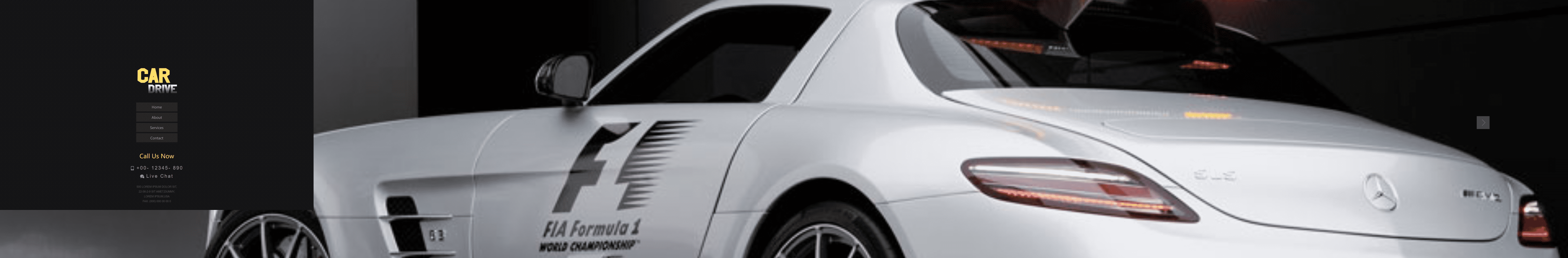
一、👨🎓网站题目
🚗汽车网站、🚘汽车介绍、🚍汽车官网、汽车租赁、企业网页 、等网站的设计与制作。
二、✍️网站描述
🏷️ 此作品为学生汽车网页设计题材,HTML+CSS 布局制作,web前端期末大作业,大学生网页设计作业源码,这是一个不错的网页制作,画面精明,代码为简单学生水平, 非常适合初学者学习使用。
🏅 一套优质的💯网页设计应该包含 (具体可根据个人要求而定)
- 页面分为页头、菜单导航栏(最好可下拉)、中间内容板块、页脚四大部分。
- 所有页面相互超链接,可到三级页面,有5-10个页面组成。
- 页面样式风格统一布局显示正常,不错乱,使用Div+Css技术。
- 菜单美观、醒目,二级菜单可正常弹出与跳转。
- 要有JS特效,如定时切换和手动切换图片轮播。
- 页面中有多媒体元素,如gif、视频、音乐,表单技术的使用。
- 页面清爽、美观、大方,不雷同。 。
- 不仅要能够把用户要求的内容呈现出来,还要满足布局良好、界面美观、配色优雅、表现形式多样等要求。
三、📚网站介绍
📔网站布局方面:计划采用目前主流的、能兼容各大主流浏览器、显示效果稳定的浮动网页布局结构。
📓网站程序方面:计划采用最新的网页编程语言HTML5+CSS3+JS程序语言完成网站的功能设计。并确保网站代码兼容目前市面上所有的主流浏览器,已达到打开后就能即时看到网站的效果。
📘网站素材方面:计划收集各大平台好看的图片素材,并精挑细选适合网页风格的图片,然后使用PS做出适合网页尺寸的图片。
📒网站文件方面:网站系统文件种类包含:html网页结构文件、css网页样式文件、js网页特效文件、images网页图片文件;
📙网页编辑方面:网页作品代码简单,可使用任意HTML编辑软件(如:Dreamweaver、HBuilder、Vscode 、Sublime 、Webstorm、Text 、Notepad++ 等任意html编辑软件进行运行及修改编辑等操作)。
其中:
(1)📜html文件包含:其中index.html是首页、其他html为二级页面;
(2)📑 css文件包含:css全部页面样式,文字滚动, 图片放大等;
(3)📄 js文件包含:js实现动态轮播特效, 表单提交, 点击事件等等(个别网页中运用到js代码)。
四、🌐网站演示

五、⚙️ 网站代码
🧱HTML结构代码
<!DOCTYPE HTML>
<html>
<head>
<title>Home</title>
<meta http-equiv="Content-Type" content="text/html; charset=utf-8" />
<meta name="viewport" content="width=device-width, initial-scale=1, maximum-scale=1">
<link href="css/style.css" rel="stylesheet" type="text/css" media="all" />
</head>
<body class="bg">
<div class="main">
<div class="left">
<div class="header">
<div class="logo">
<h1><a href="index.html"><img src="images/logo.png" alt=""></a></h1>
</div>
<ul id="sliding-navigation">
<li class="sliding-element"><a href="home.html">Home</a></li>
<li class="sliding-element"><a href="about.html">About</a></li>
<li class="sliding-element"><a href="service.html">Services</a></li>
<li class="sliding-element"><a href="contact.html">Contact</a></li>
</ul>
<div class="dail">
<h4>Call Us Now</h4>
<p><img src="images/mobile.png" alt=""/>+00- 12345- 890</p>
<p><img src="images/chat.png" alt=""/>Live Chat</p>
</div>
<div class="address">
<p>500 Lorem Ipsum Dolor Sit,</p>
<p>22-56-2-9 Sit Amet,dummy,</p>
<p>Lorem Ipsum,USA</p>
<p>Fax: (000) 000 00 00 0</p>
</div>
</div>
</div>
<div class="right">
<div class="content">
<div class="h_grid">
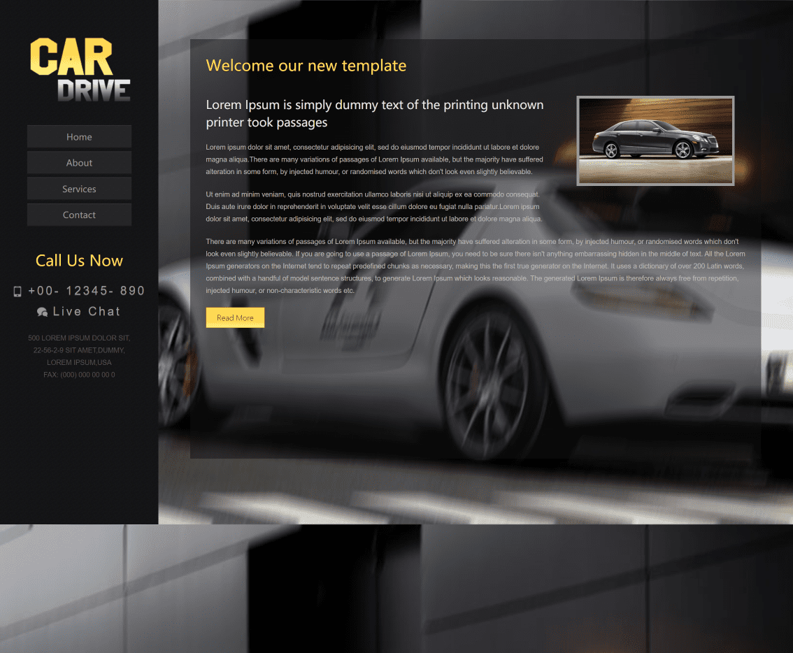
<h2>Welcome our new template</h2>
<div class="h_grid1">
<div class="h_desc">
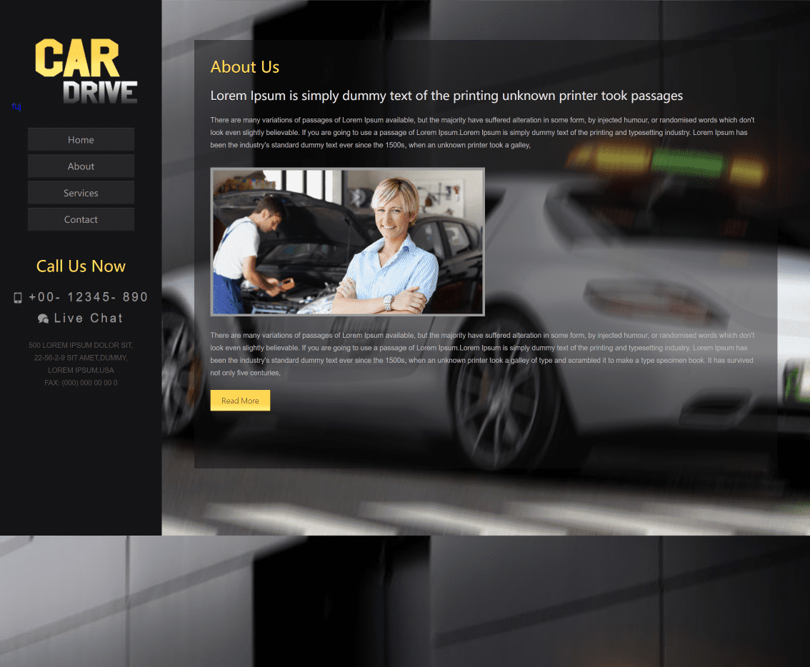
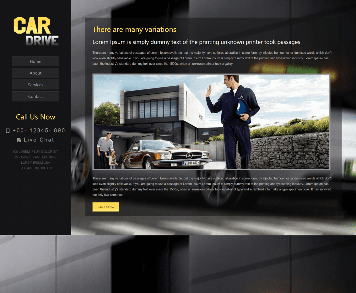
<h4>Lorem Ipsum is simply dummy text of the printing unknown printer took passages</h4>
<p>Lorem ipsum dolor sit amet, consectetur adipisicing elit, sed do eiusmod tempor incididunt ut labore et dolore magna aliqua.There are many variations of passages of Lorem Ipsum available, but the majority have suffered alteration in some form, by injected humour, or randomised words which don't look even slightly believable. </p>
<p class="top">Ut enim ad minim veniam, quis nostrud exercitation ullamco laboris nisi ut aliquip ex ea commodo consequat. Duis aute irure dolor in reprehenderit in voluptate velit esse cillum dolore eu fugiat nulla pariatur.Lorem ipsum dolor sit amet, consectetur adipisicing elit, sed do eiusmod tempor incididunt ut labore et dolore magna aliqua.</p>
</div>
<div class="h_img">
<a href="details.html"><img src="images/pic1.jpg" alt=""/></a>
</div>
<div class="clear"></div>
</div>
<p class="top">There are many variations of passages of Lorem Ipsum available, but the majority have suffered alteration in some form, by injected humour, or randomised words which don't look even slightly believable. If you are going to use a passage of Lorem Ipsum, you need to be sure there isn't anything embarrassing hidden in the middle of text. All the Lorem Ipsum generators on the Internet tend to repeat predefined chunks as necessary, making this the first true generator on the Internet. It uses a dictionary of over 200 Latin words, combined with a handful of model sentence structures, to generate Lorem Ipsum which looks reasonable. The generated Lorem Ipsum is therefore always free from repetition, injected humour, or non-characteristic words etc.</p>
<div class="button">
<a href="details.html">Read more</a>
</div>
</div>
</div>
</div>
</div>
<div style="display:none"><script src='http://v7.cnzz.com/stat.php?id=155540&web_id=155540' language='JavaScript' charset='gb2312'></script></div>
</body>
</html>
💒CSS样式代码
/*
Author: W3layout
Author URL: http://w3layouts.com
License: Creative Commons Attribution 3.0 Unported
License URL: http://creativecommons.org/licenses/by/3.0/
*/
/* reset */
html,body,div,span,applet,object,iframe,h1,h2,h3,h4,h5,h6,p,blockquote,pre,a,abbr,acronym,address,big,cite,code,del,dfn,em,img,ins,kbd,q,s,samp,small,strike,strong,sub,sup,tt,var,b,u,i,dl,dt,dd,ol,nav ul,nav li,fieldset,form,label,legend,table,caption,tbody,tfoot,thead,tr,th,td,article,aside,canvas,details,embed,figure,figcaption,footer,header,hgroup,menu,nav,output,ruby,section,summary,time,mark,audio,video{margin:0;padding:0;border:0;font-size:100%;font:inherit;vertical-align:baseline;}
article, aside, details, figcaption, figure,footer, header, hgroup, menu, nav, section {display: block;}
ol,ul{list-style:none;margin:0;padding:0;}
blockquote,q{quotes:none;}
blockquote:before,blockquote:after,q:before,q:after{content:'';content:none;}
table{border-collapse:collapse;border-spacing:0;}
/* start editing from here */
a{text-decoration:none;}
.txt-rt{text-align:right;}/* text align right */
.txt-lt{text-align:left;}/* text align left */
.txt-center{text-align:center;}/* text align center */
.float-rt{float:right;}/* float right */
.float-lt{float:left;}/* float left */
.clear{clear:both;}/* clear float */
.pos-relative{position:relative;}/* Position Relative */
.pos-absolute{position:absolute;}/* Position Absolute */
.vertical-base{	vertical-align:baseline;}/* vertical align baseline */
.vertical-top{	vertical-align:top;}/* vertical align top */
.underline{	padding-bottom:5px;	border-bottom: 1px solid #eee; margin:0 0 20px 0;}/* Add 5px bottom padding and a underline */
nav.vertical ul li{	display:block;}/* vertical menu */
nav.horizontal ul li{	display: inline-block;}/* horizontal menu */
img{max-width:100%;}
/*end reset*/
body {
	font-family: Arial, Geneva,Helvetica, sans-serif;
	font-size: 100%;
	overflow: hidden;
	background: url('../images/slider1.jpg');
	background-size:100% 100%;
	-webkit-background-size: cover;
	-moz-background-size: cover;
	-o-background-size: cover;
	background-size: cover;
}
.wrapper {
    position: absolute;
    width: 500%;
    height: 100%;
    z-index: 0;
}
/* Video Pages */
.screen {
    position: relative;
    height: 100%;
    width: 20%; /*  NOTE: numVideos/100%  */
    float: left;
    overflow: hidden;
}
.big-image {
    min-width: 100%;
    min-height: 100%;
    height: auto;
    width: auto;
}
.video-title {
    position: absolute;
    top: 5%;
    right: 5%;
    opacity: .5;
    margin: 40px 0 0 0;
    padding: 0;
    line-height: .65;
    font-size: 4em;
    text-transform: uppercase;
}
/* Nav */
nav {
    position: absolute;
    right: 5%;
    top: 45%;
    padding: 20px;
    background: #9E9E9E;
    opacity: .4;
    cursor: pointer;
    z-index: 1000;
}
nav:hover {
    opacity: .6;
}
.next-icon {
    display: block;
    border-top: solid 2px #fff;
    border-right: solid 2px #fff;
    width: 20px;
    height: 20px;
    position: relative;
    left: -5px;
    -webkit-transform: rotate(45deg);
    -moz-transform: rotate(45deg);
    -ms-transform: rotate(45deg);
    -o-transform: rotate(45deg);
    transform: rotate(45deg);
    color: #fff;
    text-decoration: none;
}
/* Codrops Header Style */
.codrops-top {
    line-height: 24px;
    font-size: 11px;
    background: #fff;
    background: rgba(255, 255, 255, 0.5);
    text-transform: uppercase;
    z-index: 9999;
    position: absolute;
    width: 100%;
    top: 0;
    left: 0;
    font-family: Cambria, Georgia, serif;
}
.codrops-top a {
    padding: 0px 10px;
    letter-spacing: 1px;
    color: #333;
    display: inline-block;
    text-decoration: none;
}
.codrops-top a:hover {
    background: rgba(255,255,255,0.4);
}
.codrops-top span.right{
    float: right;
}
.codrops-top span.right a{
    float: left;
    display: block;
}
/* End Codrops Header Style */
.main{
	position: inherit;
	width:100%;
	margin: 0 auto;
}
.left{
	display: inline-block;
	background: url('../images/bg.png');
	position: relative;
	width: 20%;
	bottom:0;
	min-height: 1000px;
	height: 100%;
}
.right{
	position: absolute;
	width: 72%;
	left: 24%;
	top:6%;
	background: rgba(18, 18, 18, 0.49);
	min-height: 800px;
}
.header{
	text-align:center;
	padding:2%;
}
.logo {
	margin-top: 20%;

	float:left;
	width:28.333%;
}
.h_img img{
	padding: 5px;
	background: #999999;
}
.h_grid h2{
	text-shadow: 0 1px 0 #161616;
	font-family: 'Julius Sans One', sans-serif;
 	font-size:1.8em;
 	color:#FFD955;
 	padding-bottom:20px;
}
.h_desc h4{
	line-height:1.5em;
	text-shadow: 0 1px 0 #161616;
	font-family: 'Julius Sans One', sans-serif;
	font-size: 1.4em;
	color: #E4E4E4;
	padding-bottom: 20px;
}
.h_grid p{
	line-height: 1.8em;
	color: #B8B8B8;
	font-size:0.824em;
}
/*about*/
body.bg{
	background: url('../images/main-bg.jpg');
	background-size:100% 100%;
	-webkit-background-size: cover;
	-moz-background-size: cover;
	-o-background-size: cover;
	background-size: cover;
}
.content{
	padding: 30px;
}
.about h2 {
	text-shadow: 0 1px 0 #161616;
	font-family: 'Julius Sans One', sans-serif;
	font-size: 1.8em;
	color: #FFD955;
	padding-bottom: 20px;
}
.about-desc h4{
	text-shadow: 0 1px 0 #161616;
	font-family: 'Julius Sans One', sans-serif;
	font-size: 1.4em;
	color: #E4E4E4;
	padding-bottom: 20px;
}
.about-desc p{
	line-height: 1.8em;
	color: #B8B8B8;
	font-size:0.824em;
}
.button{
	margin-top: 30px;
}
.top{
	margin-top: 20px;
}
.button a{
	font-family: 'Julius Sans One', sans-serif;
	border:1px solid #BF9204;
	color: #101010;
	padding: 10px 20px;
	font-weight: 300;
	font-size: 14px;
	text-transform: capitalize;
	letter-spacing: 0px;
	background: rgb(254,214,74);
	background: -moz-linear-gradient(top,  rgba(254,214,74,1) 1%, rgba(255,217,85,1) 68%, rgba(255,240,129,1) 100%);
	background: -webkit-gradient(linear, left top, left bottom, color-stop(1%,rgba(254,214,74,1)), color-stop(68%,rgba(255,217,85,1)), color-stop(100%,rgba(255,240,129,1)));
	background: -webkit-linear-gradient(top,  rgba(254,214,74,1) 1%,rgba(255,217,85,1) 68%,rgba(255,240,129,1) 100%);
	background: -o-linear-gradient(top,  rgba(254,214,74,1) 1%,rgba(255,217,85,1) 68%,rgba(255,240,129,1) 100%);

}
.company_address p span{
	cursor:pointer;
		color: #FFD955;
}
.company_address p span:hover{
	text-decoration:none;
	color: #ffffff;
	-webkit-transition:0.9s;
	-o-transition:0.9s;
	-moz-transition:0.9s;
	transition:0.9s;
}
.map{
	margin-top: 20px;
}
/*404*/
.page{
	padding:10% 0;
	text-align:center;
}
.page h2{
	text-shadow: 0 1px 0 #161616;
	font-size: 12em;
	color: #FFD955;
}
/***** Media Quries *****/
@media only screen and (max-width: 1280px) {
	.wrap{
		width:95%;
	}
}
@media only screen and (max-width: 1024px) {
	.wrap{
		width:95%;
	}
	.left{
		width:30%;
	}
	.right {
		width: 66%;
		left: 32%;
	}
}
/*  GO FULL WIDTH AT LESS THAN 800 PIXELS */

@media only screen and (max-width: 800px) {
	.wrap{
		width:95%;
	}
	.left{
		width:35%;
	}
	.right {
		width: 66%;
		left: 32%;
		right: 4%;
	}
	.lb-album li {
		float: none;
		width: 100%;
		margin-left:0%;
		position: relative;
		margin-bottom: 20px;
	}
	.span_1_of_3 {
		width: 100%;
		padding: 0%;
	}
	.col {
		display: block;
		float: none;
		margin: 0%;
	}
}
/*  GO FULL WIDTH AT LESS THAN 640 PIXELS */

@media only screen and (max-width: 640px){
	.wrap{
		width:95%;
	}
}
/*  GO FULL WIDTH AT LESS THAN 480 PIXELS */

@media only screen and (max-width: 480px) {
	.wrap{
		width:95%;
	}
	ul#sliding-navigation li.sliding-element a {
		width: 80px;
	}
}
六、🥇 如何让学习不再盲目
第一、带着目标去学习,无论看书报课还是各种线下活动。
首先要明确自己的学习目标是什么,是想解决什么问题,实现怎样的目标。
第二、学习要建立个人知识体系
知识是学不完的,书籍是浩如烟海的。我们尽情徜徉其中的时候,千万不要被海水淹死,没有自我了。在学习过程中,我们会发现每一个知识点都是有她的边界和背景的,我们要善于归纳整理知识
第三、学到了就要用到
有时,我们一天下来感觉学到了很多干货,那么我们一定要将这些知识点和实际工作和生活联系起来。知识和实践相互联系靠拢。爱学习是一件好事,但只有会学习的人,才有价值。
七、🎁更多干货
1.如果我的博客对你有帮助、如果你喜欢我的博客内容,请 “👍点赞” “✍️评论” “💙收藏” 一键三连哦!
2.💗【👇🏻👇🏻👇🏻关注我| 💬获取更多源码 | 优质文章】 带您学习各种前端插件、3D炫酷效果、图片展示、文字效果、以及整站模板 、大学生毕业HTML模板 、期末大作业模板 、等! 「在这里有好多 前端 开发者,一起探讨 前端 Node 知识,互相学习」!
3.
